Back to top

Cho restaurant

A geisha, some manga strips, the drawing of a building in Tokyo and a few sumo wrestlers.

romano_cho-restaurant-01
romano_cho-restaurant-02
romano_cho-restaurant-03
romano_cho-restaurant-04
romano_cho-restaurant-05

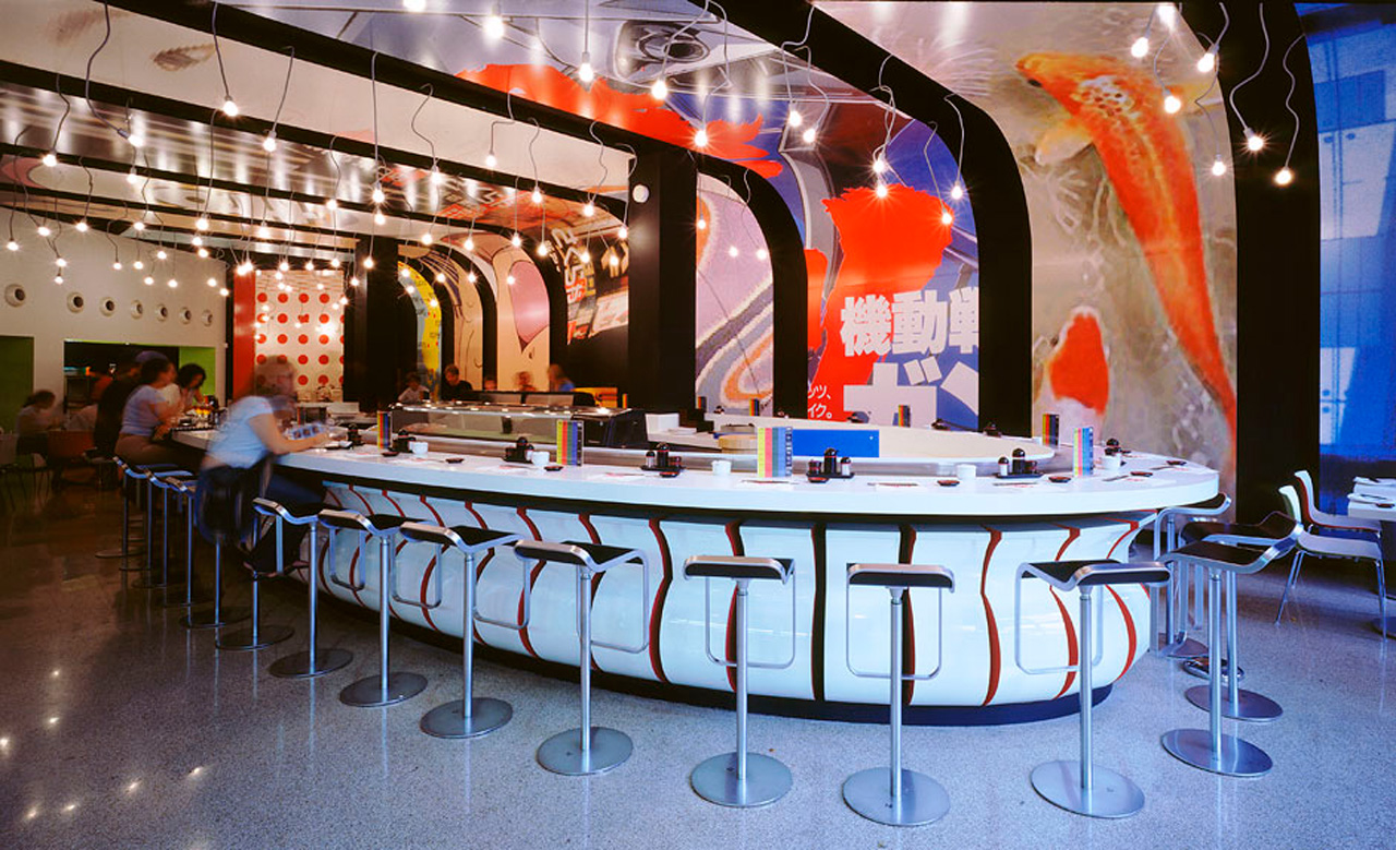
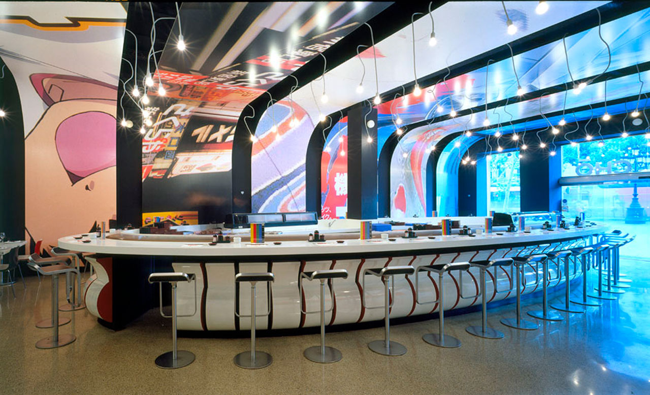
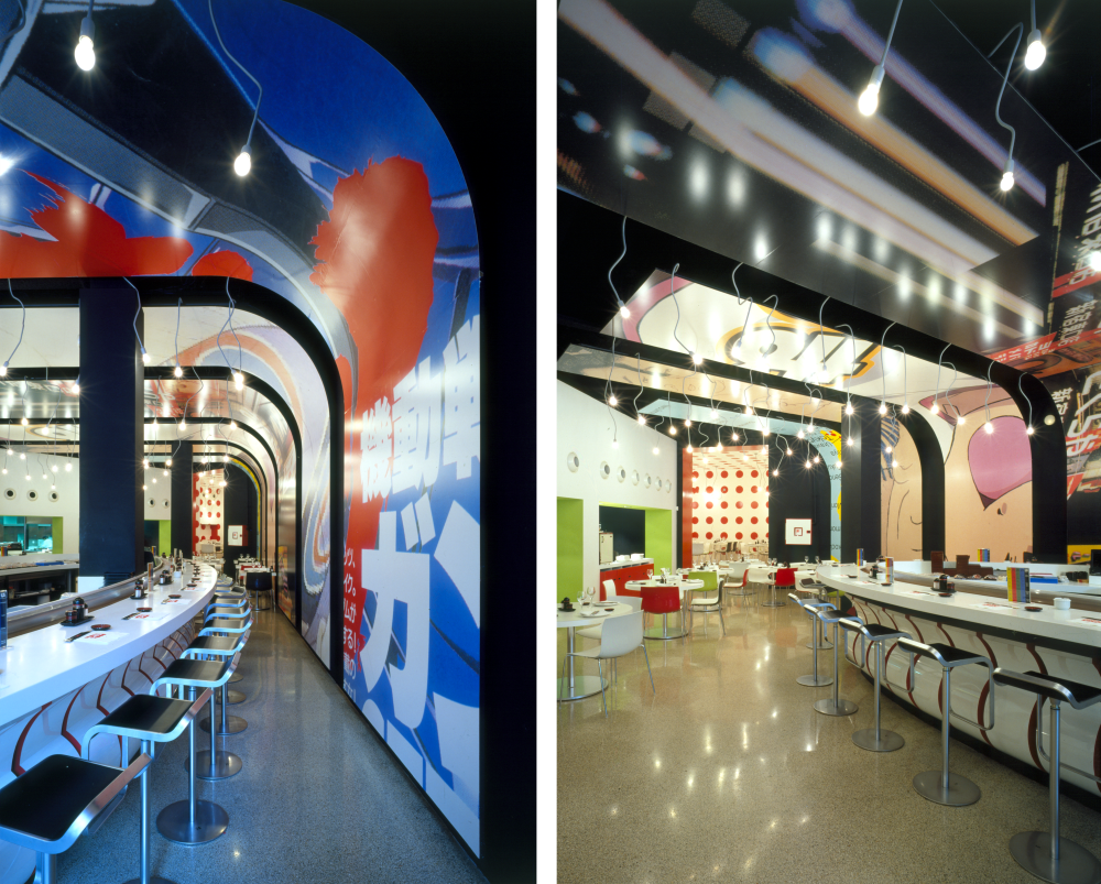
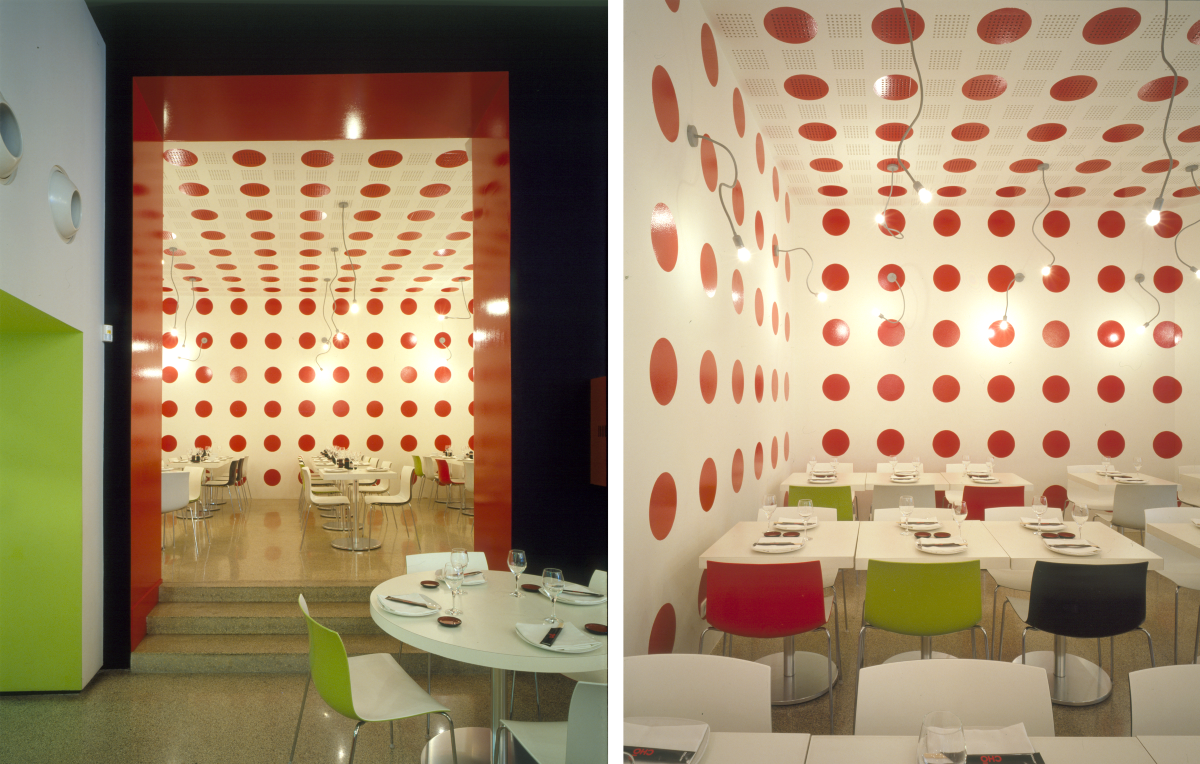
When one acts without prejudice, fields open up – the stylistic ones included. Cho is not the result of a sought-after aesthetic but of an intellectual mechanism deprived of insecurities, and also anti-snob, anti-intelligenzia and anti-groupal which resulted in a pop fluke.

The project was fun from the start: we only had six weeks to turn a Burger King branch into a Japanese restaurant for a client who didn´t have any connection to Japan. We made the measurements incognito while eating hamburgers in there.

One tempting option was to mimic the widespread classic, elegant, Zen, minimalist Japanese restaurant, which required an in-depth immersion in Japanese interior design. We could also emphasize our European preconceived ideas of the Japanese archetypes and interpret them with no further knowledge of what a restaurant in Japan really looks like.

We didn´t even need to imagine, it was just about putting all archetypes together. We came up with a few tapes made of wood that we used as a billboard where we compiled some Japanese icons: a geisha, some manga strips, the drawing of a building in Tokyo, a few sumo wrestlers…

And, of course, the Japanese flag. The answer for the interior room came thanks to an error in a collaborator’s render. Out of the blue, the Japanese flag was projected repeatedly throughout the room, which soon became decorated with red polka dots all over. We decided to bet on this random event and left them all except one, which we slightly shaped like a butterfly – in Japanese, cho.

Date of construction
2002, Barcelona
Architects
Jaime Romano
Collaborators
Oriol Florejachs
Toni Garriga
Industrials
Movical
Muebles Castelló